
The Best White Paint: How to Choose the Right Shade for a Timeless Home
Today, we turn our attention to one of the most deceptively complex decisions in interior design: choosing the perfect white paint. While it may seem simple, the nuance of white is what makes it so powerful, and so perilous, when crafting a refined, elegant interior. In the world of The Mayfair Hall, where Georgian architecture meets Parisian neoclassicism, white is never just white. It is a backdrop, a highlight, and a tone-setter all at once.

Why White Is Never Just White
A white paint can soften harsh light, brighten shadowy corners, or warm a grand room. The right shade can showcase plaster walls, elevate ornate millwork, and quietly frame antique furniture and art. But the wrong white? It can turn sterile, flat, or uncomfortably cold.
Great decorators have always known this. Billy Baldwin once said, “Stick to the things you really love. An honest room is always up to date.” For Baldwin, the perfect white was never the brightest, but the one that allowed treasured objects to shine. Sister Parish and Albert Hadley often relied on warm whites to bring softness to traditional architecture. Charlotte Moss, too, has favored whites that feel like muslin or ivory, gentle, creamy, and never glaring.
Where to Use White, and Which Whites to Choose
Let’s look at how to use white throughout your home, and the shades most favored by designers with a classic sensibility:
1. Walls
For walls, opt for soft, warm whites that feel graceful and welcoming. In classically inspired interiors, like those influenced by English country houses or Haussmann apartments, white should never feel stark.
-
Best Picks for Walls:
-
Benjamin Moore White Dove (OC-17) – a soft, warm white that flatters both natural and artificial light.
-
Benjamin Moore Pale Oak (OC-20) – a greige-tinted white that adds depth and calmness.
-
Benjamin Moore Swiss Coffee (OC-45) – subtle with just enough body to feel elegant.
-
These tones pair beautifully with natural wood floors, linen curtains, and architectural moldings.
2. Millwork, Trim & Doors
Trim should feel crisp but not jarring. For crown moldings, paneling, and wainscoting, choose a white with a touch more brightness to highlight craftsmanship without overpowering the room.
-
Best Picks for Trim & Millwork:
-
Benjamin Moore Chantilly Lace (OC-65) – bright and clean, ideal when contrast is needed.
-
Benjamin Moore Simply White (OC-117) – softly luminous, excellent with warm-toned walls.
-
Benjamin Moore Swiss Coffee (OC-45) – a decorator favorite for its creamy but polished look.
-
If you’re painting both walls and trim in white, consider the same color in different finishes as an option instead of two different tones (e.g., eggshell for walls, semi-gloss for trim). The way the light reflects the finish will give the impression of different tonalities.
3. Ceilings
Ceilings are best kept subtle and retreating—think a whisper of white that reflects natural light without pulling focus.
-
Best Picks for Ceilings:
-
Benjamin Moore Cloud White (OC-130) – a warm neutral white that reflects light beautifully.
-
Benjamin Moore Alabaster (876) – soft and creamy, it pairs seamlessly with both warm and cool walls.
-

White in The Mayfair Hall Classic Style
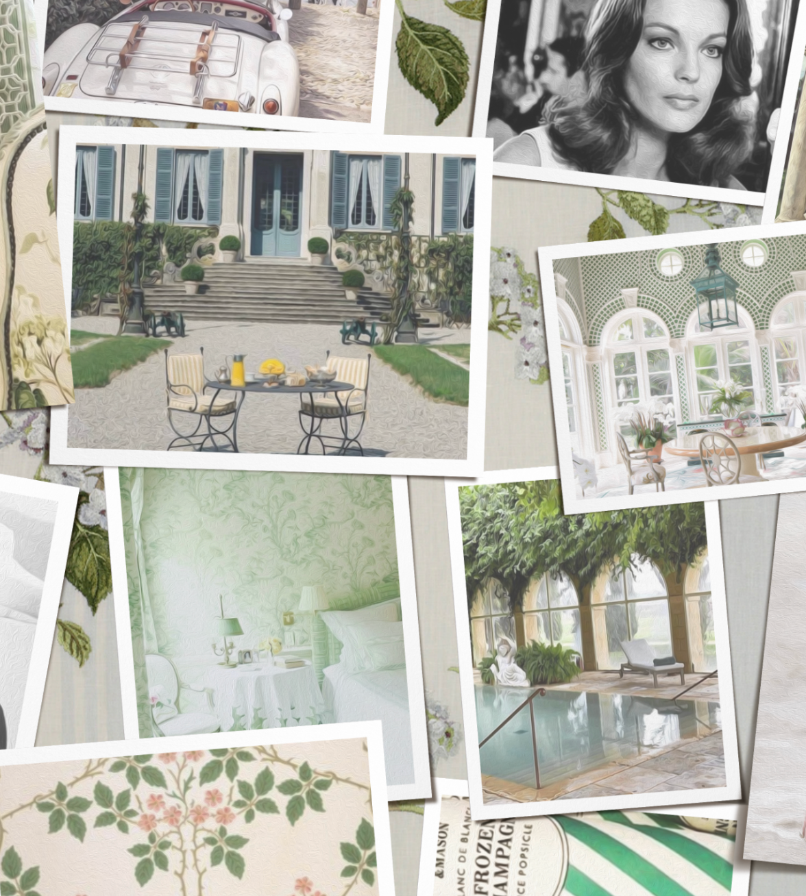
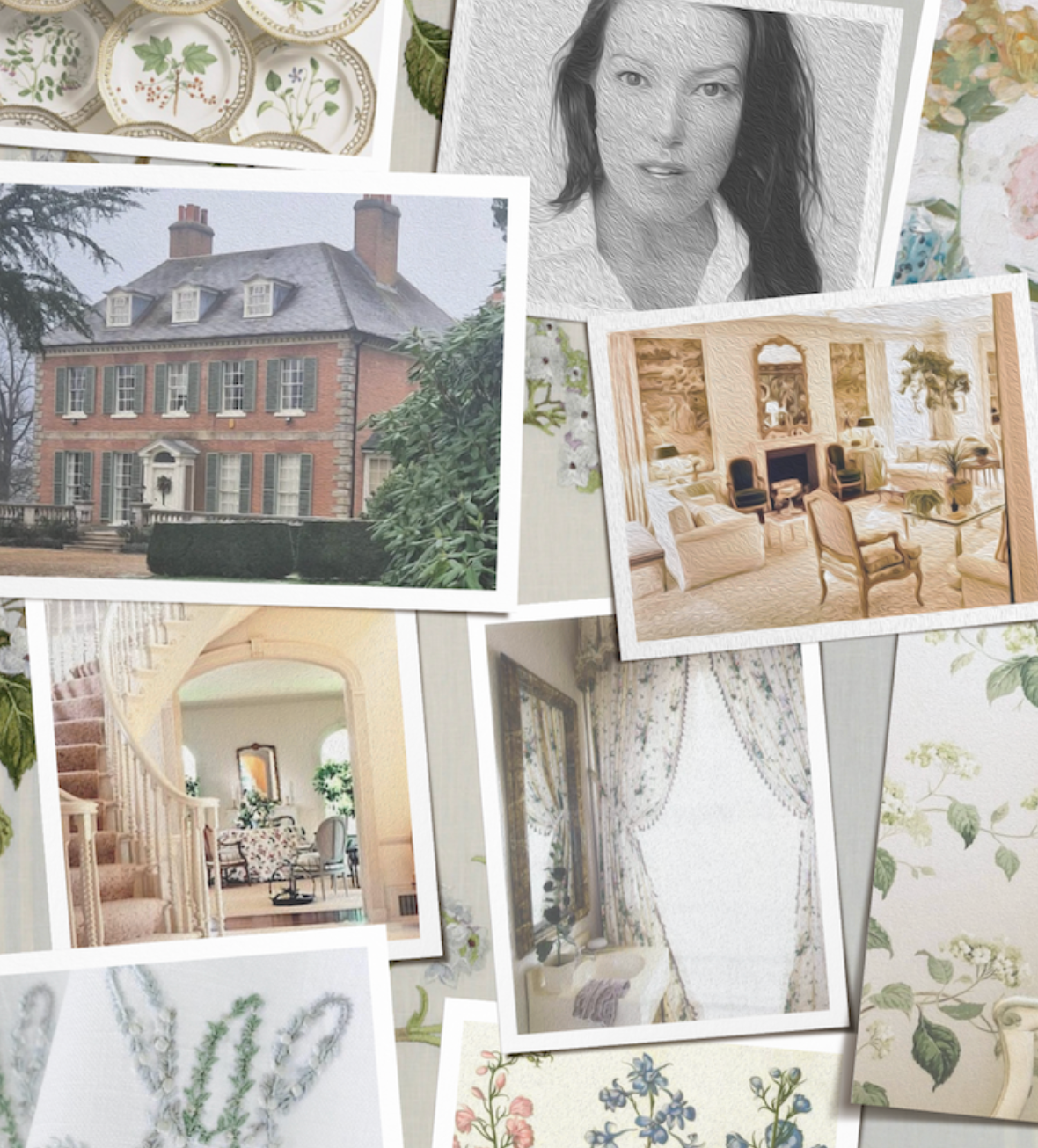
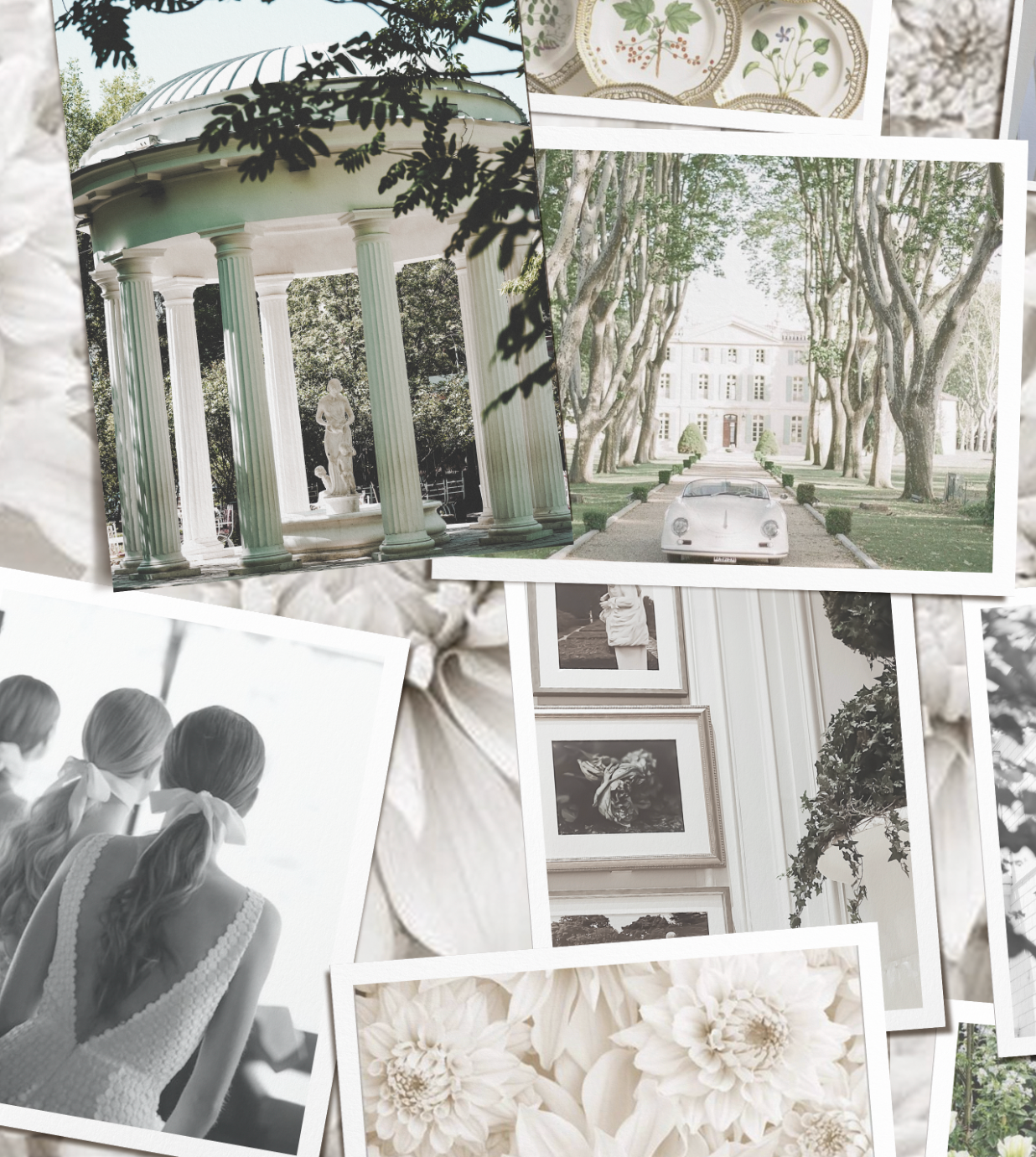
In The Mayfair Hall’s vision, where American Georgian form meets French neoclassical finesse, white plays a foundational role. Our preference leans toward warmer, chalky whites that feel timeworn yet fresh. They should evoke apartments in Paris or the quiet dignity of a Virginia estate.
-
White Dove and Swiss Coffee are our current go-to choices for walls that need to feel lived-in yet luminous.
-
Chantilly Lace or Cloud White for moldings offers just enough sharpness to make architectural details sing.
-
Pale Oak is a favorite in transitional spaces, such as hallways or libraries, where mood and depth are essential.
In our Virginia Project, we are considering White Dove for the walls, Chantilly Lace for the trim, and Alabaster for the ceiling—achieving a harmony that feels both historical and effortlessly modern. That said, many tests are ahead of us until we finalize the decisions.
Final Thoughts
White is not a fallback, it’s a feature. Choosing the right white paint should be a slow, thoughtful process. Always sample generously, observe the colors at all times of day, and trust your intuition. The best white is the one that supports your vision while allowing the beauty of your home to take center stage.
Reminders
– Test samples on multiple walls and revisit throughout the day.
– Use different finishes to subtly distinguish trim from walls.
– Choose warmth over starkness in rooms with little natural light.
I Am Grateful for Today
– A freshly painted room and its quiet beauty.
– The elegance of restraint.
– Knowing white is never boring, it’s timeless.
All of the paint colors mentioned in this post are part of the Benjamin Moore collection, a brand I personally turn to time and again for its exceptional quality and timeless palette. This is not a sponsored recommendation, simply a trusted favorite that continues to serve beautifully in both classic and modern interiors. To explore further, visit the Benjamin Moore website for detailed color profiles and sample options.


